How to Mix Pillow Colors: Easy Color Combinations for Sofas and Beds
Mismatched pillows are rarely a bad color choice. They’re colors chosen with nothing tying them together.
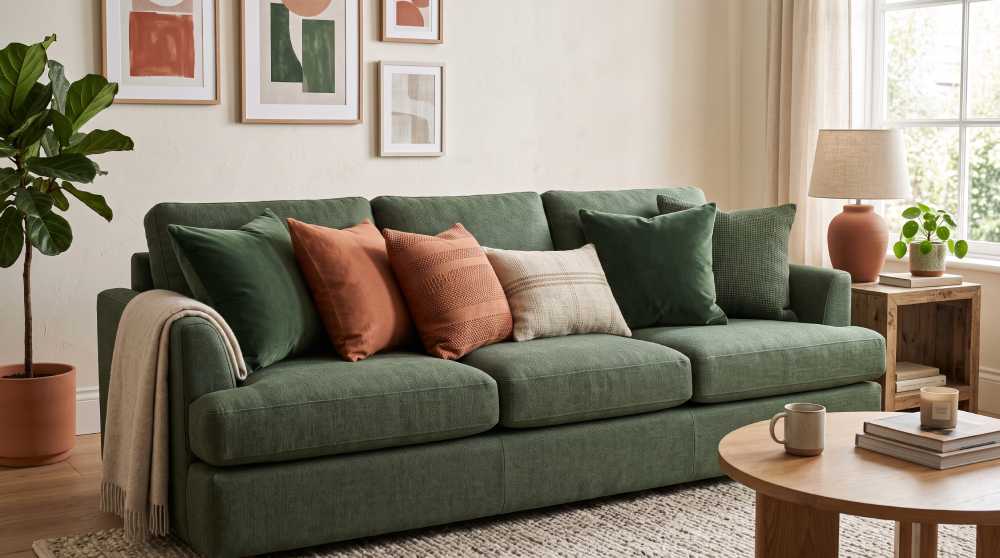
Pillow color mistakes rarely come from picking an ugly color. They come from picking several perfectly nice colors with no plan connecting them. A room can have great individual pillows and still look mismatched, because “individually nice” and “working together” are two different things. Building a pillow palette is less about taste than about following a short, repeatable process.
Look at the room before you look at pillows
The palette shouldn’t start with the pillows. It should start with what’s already fixed in the room and expensive to change: the sofa or bedding color, the rug, any large piece of art. Pull two or three colors directly from those existing pieces rather than starting from a color you simply like. A pillow palette that ignores the room around it is the fastest way to end up with something that looks randomly assembled, no matter how well the pillows coordinate with each other.
Choose one main color first
Pick a single color to carry the most visual weight, usually the color that shows up most in the room already, or the one you want to introduce as the room’s new focal color. This becomes the color that appears on your largest pillow or on more than one pillow in the arrangement. Every other color in the mix is there to support this one, not compete with it for attention.
Add one accent, not three
Once the main color is set, choose a single accent to pair with it, ideally a color that sits opposite it on the color wheel (like blue with a warm orange or rust) or one that’s a close, related shade for a quieter effect (like two different greens). One accent, repeated on at least two pillows, reads as a deliberate combination. Three or four different accent colors, each appearing once, reads as leftovers gathered from different shopping trips.
A palette isn’t the number of colors on the sofa. It’s how many of them repeat.
Let a neutral do the connecting
Cream, oatmeal, soft gray or warm white pillows aren’t a compromise choice, they’re the piece that lets a bold main color and an accent sit next to each other without clashing. Placing a neutral pillow between your main color and your accent gives the eye a resting point, and it’s usually the easiest way to add a third pillow to an arrangement without overcomplicating the palette.
Mix patterns with solids, not with other patterns
A patterned pillow pulls colors from across its design, so pairing it with another equally busy pattern usually creates competition rather than harmony. Instead, let one patterned pillow, ideally one that contains your main color and your accent within its own design, sit alongside solid-color pillows in those same two shades. The pattern becomes the piece that ties the solids together rather than one more competing element.
Warm palettes and cool palettes read differently
Warm combinations (rust, mustard, terracotta, warm cream) tend to feel cozy and grounded, and suit rooms built around wood tones and warm lighting. Cool combinations (navy, sage, dusty blue, cool gray) feel calmer and more restrained, and suit rooms with a lot of natural light or cooler-toned furniture. Neither is more correct, but mixing warm and cool accents in the same arrangement without a neutral to bridge them is one of the more common ways a palette starts to feel off, even when every individual color is attractive.
Sofa and bed call for different pillow counts, same palette logic
The color rules above (one main, one accent, a neutral to connect) apply whether you’re working with three pillows on a sofa or six across a bed. What changes is scale: a bed has more surface, so the same palette can stretch across more pillows without feeling repetitive, while a sofa with only two or three needs each color choice to work harder. For the arrangement itself once the colors are chosen, our guide to styling a sofa and our guide to layered bedding cover placement and sizing in more detail.
Beyond color, a few other things to watch
Color is only one part of a pillow arrangement going right or wrong. Pillow count relative to the furniture, mixing enough sizes, and how the pillows are physically placed all matter just as much as the palette, and getting the colors right won’t fix an arrangement that falls down on those. Our guide to common decorative pillow mistakes covers those other pitfalls in full.
Start with the two or three colors already in the room, choose one to lead, one to support, and let a neutral connect them. Everything else in a pillow palette follows from getting that first decision right.